

Pay less for better AI with this dashboard
We monitor the AI usage of all teams with it.

This is “Effective Delivery” — a newsletter from The Software House about improving software delivery through smarter IT team organization.
It was created by our senior technologists who’ve seen how strategic team management raises delivery performance by 20-40%.

TL;DR
Monitoring AI usage isn’t only about cutting costs,
Our open-source dashboard tracks AI usage in GitHub Copilot,
It helped us improve AI output quality, on top of cost savings,
Fork it and tailor it to your organization’s needs.
Contents
1. The visibility gaps in AI development
2. Copilot AI Usage Dashboard overview
3. 6 AI usage tracking use cases
4. Get started with the dashboard
Hey, it’s Marek.
2026 saw AI companies crack down on the use of flat-rate plans.
GitHub Copilot moved everyone to usage-based AI credits, while Anthropic banned 3rd party agent frameworks like OpenClaw from running through Claude Pro or Max.
This made companies more interested in cost-optimizing AI usage.
Good.
But if you want to make better software with AI, don’t overfocus on AI spending.
We have our own tool, Copilot AI Usage Dashboard.
We’re optimizing AI costs and output at the same time with it.
The visibility gaps in AI development
We’ve been using GitHub Copilot for a while.
We love it. We’ve built our delivery framework around it, which helped us deliver a 100% AI-driven project with one developer instead of three.
But the default reporting for GitHub Copilot and similar AI coding tools is lacking.
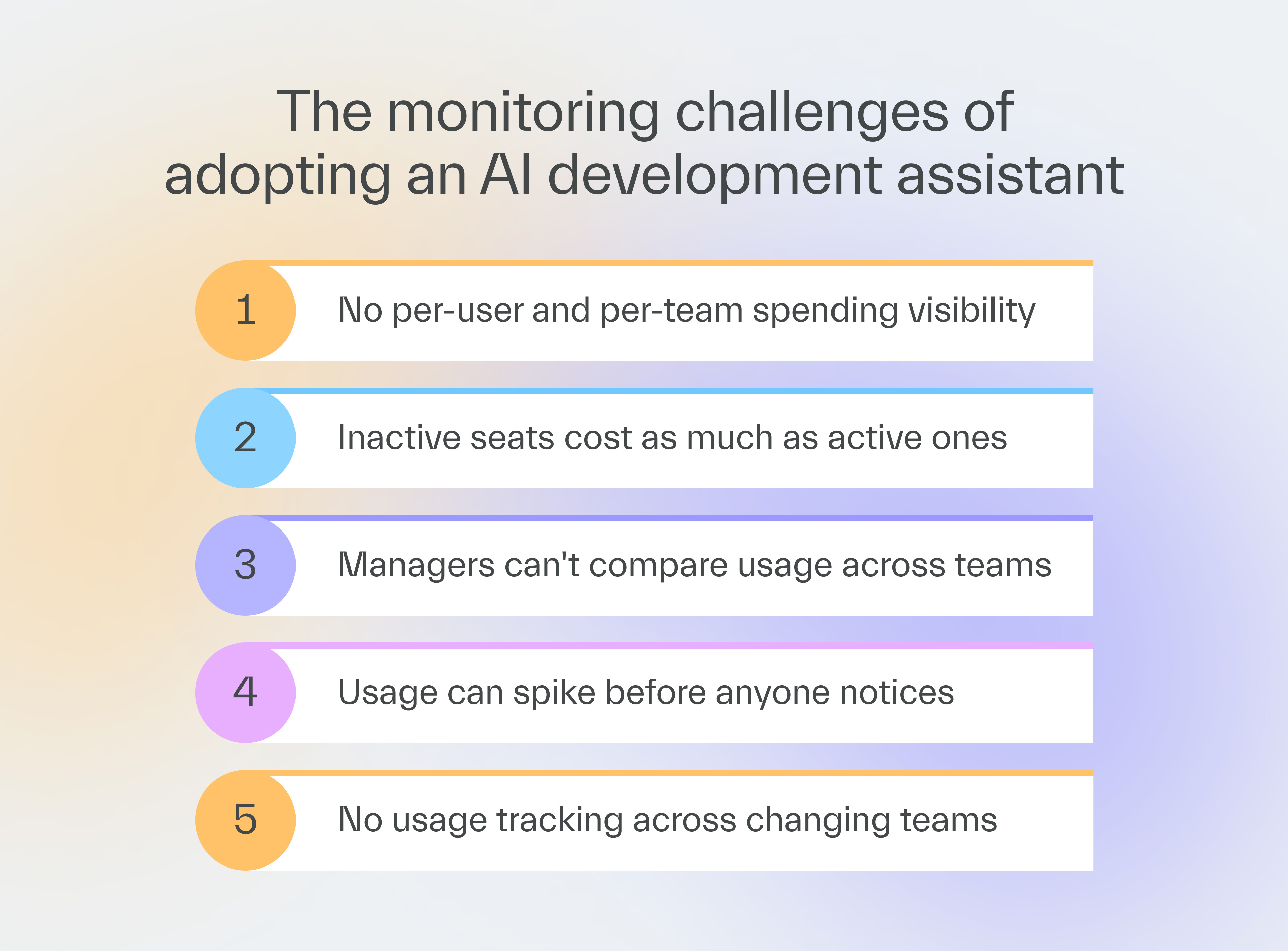
They tend to have three visibility gaps that make it hard to minimize spending and maximize outcome quality.
The spending gap
GitHub Copilot shows the total bill, but not the user- or team-level breakdown behind it.
AI usage can jump on a single seat or team and you won’t know why your invoice is so high.
The people gap
This lack of spending breakdown shows how little you know about individual and team-level AI usage in regular tools.
There is no easy way for managers to compare their team’s usage against other teams.
That makes it harder to estimate AI compute cost for a new project or decide which model to use now for a given job.
The time gap
When teams are small, which is common in AI-driven development, a single person moving to a different team may change the usage trends within that team drastically.
But there’s no easy way to follow usage shifts over time on a team- or department-level, one that also accounts for team composition changes.
Copilot AI Usage Dashboard overview
We used our AI framework, Copilot Collections, to build a tool to close the visibility gaps.
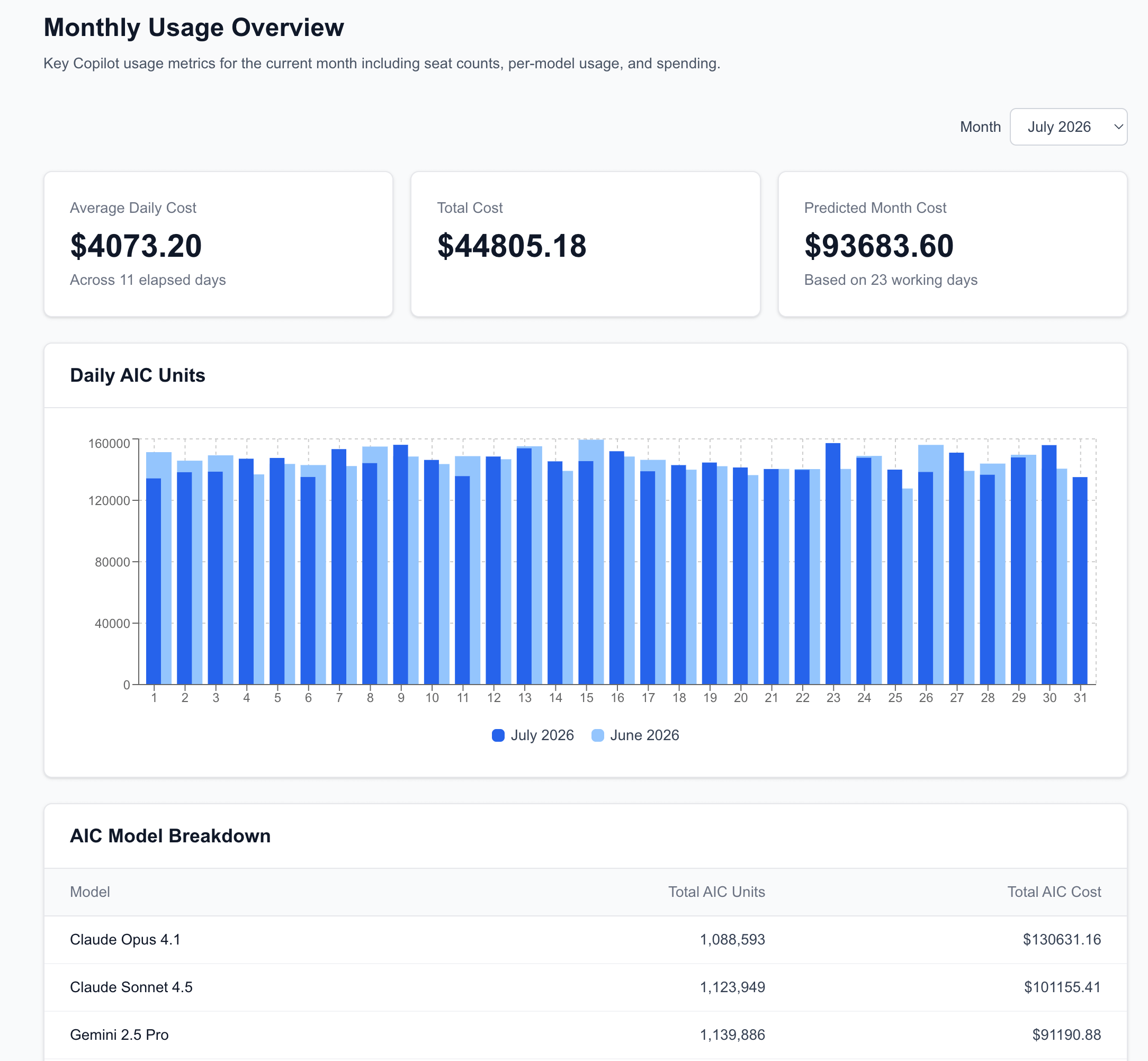
The monthly overview
Copilot AI Usage Dashboard provides a look into the following details:
monthly total spend,
predicted monthly costs,
monthly snapshots.
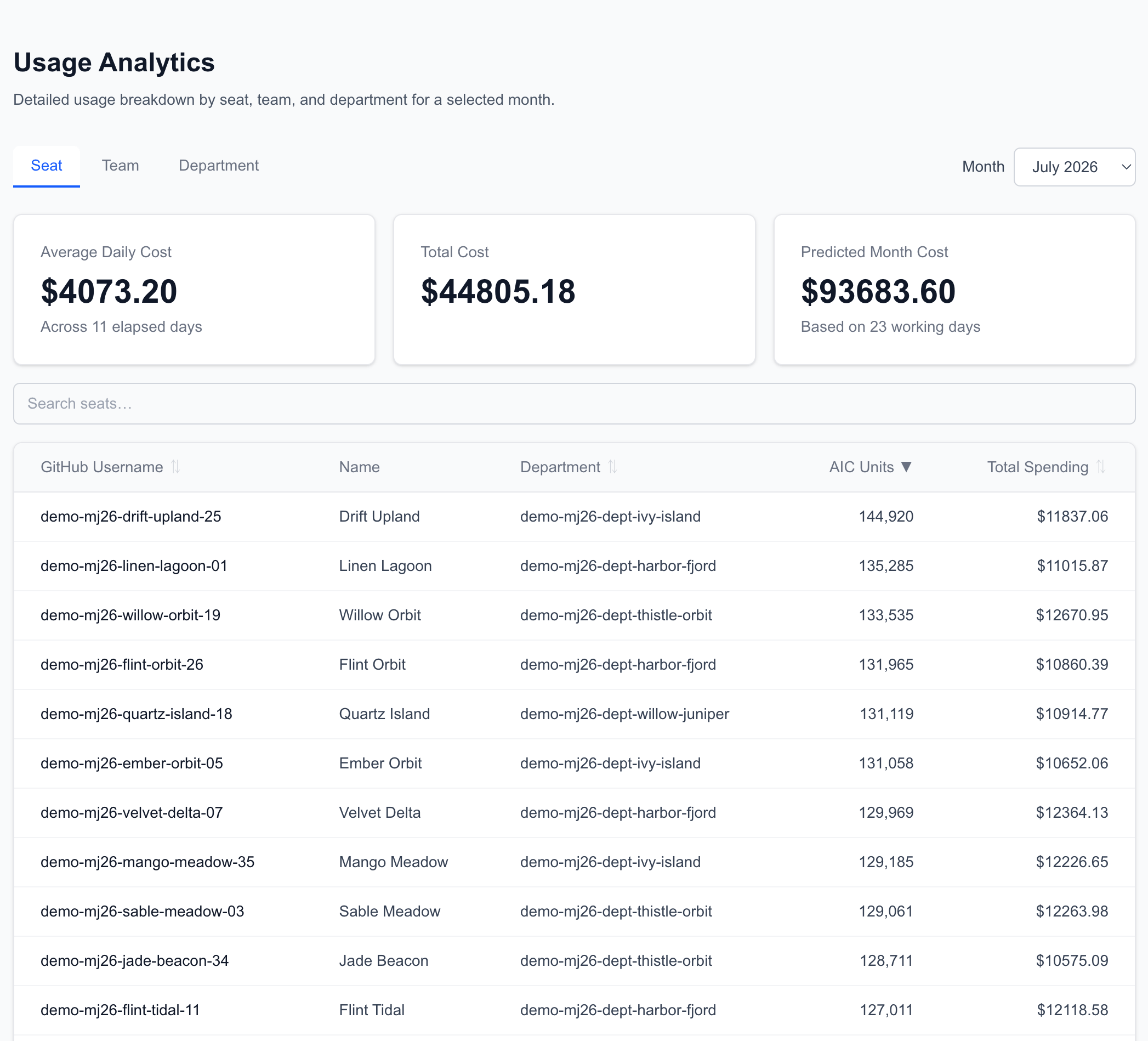
Multi-level usage analytics
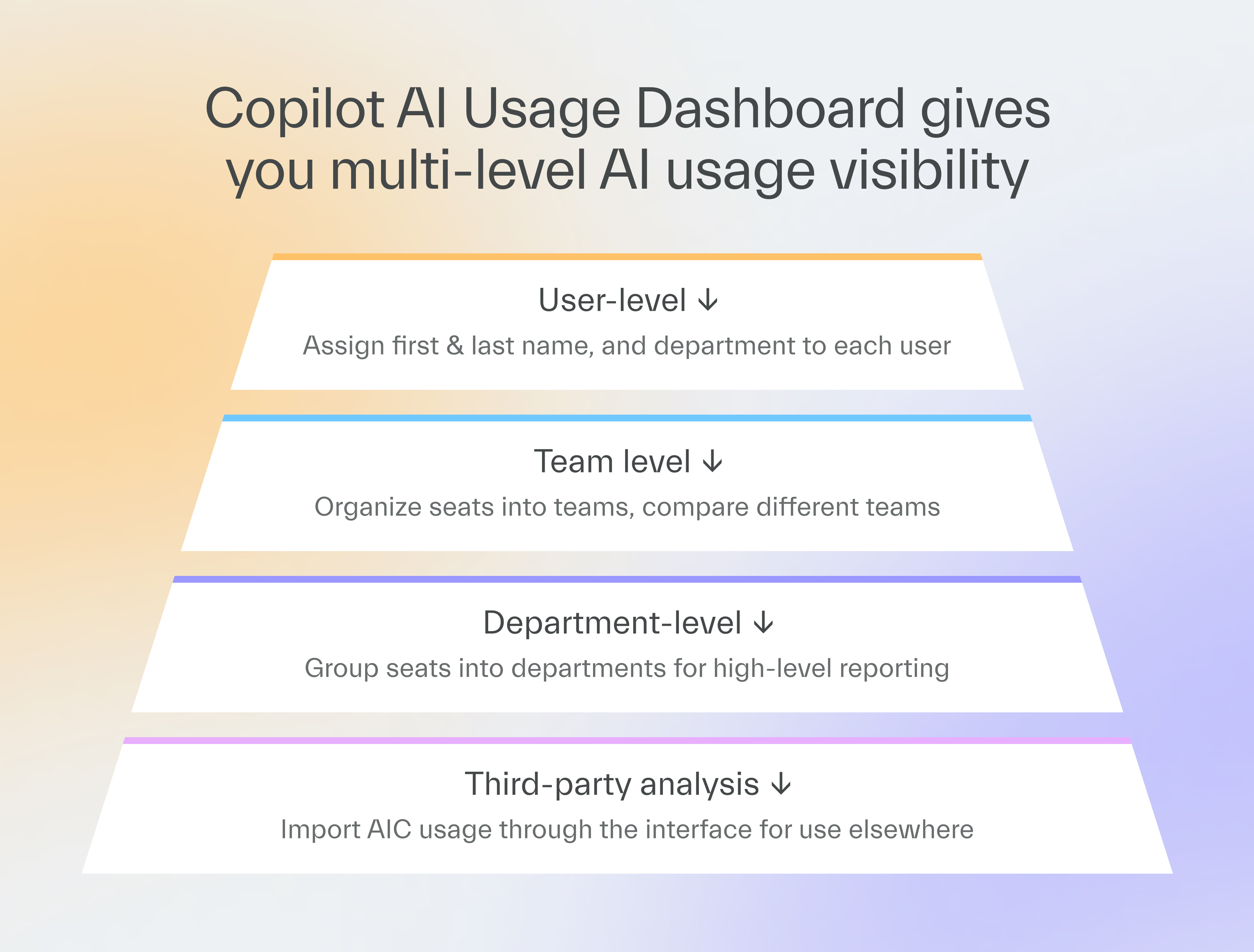
You get user-, team-, and department-level data covering the following:
AI Credits used,
total spending,
average & predicted values.
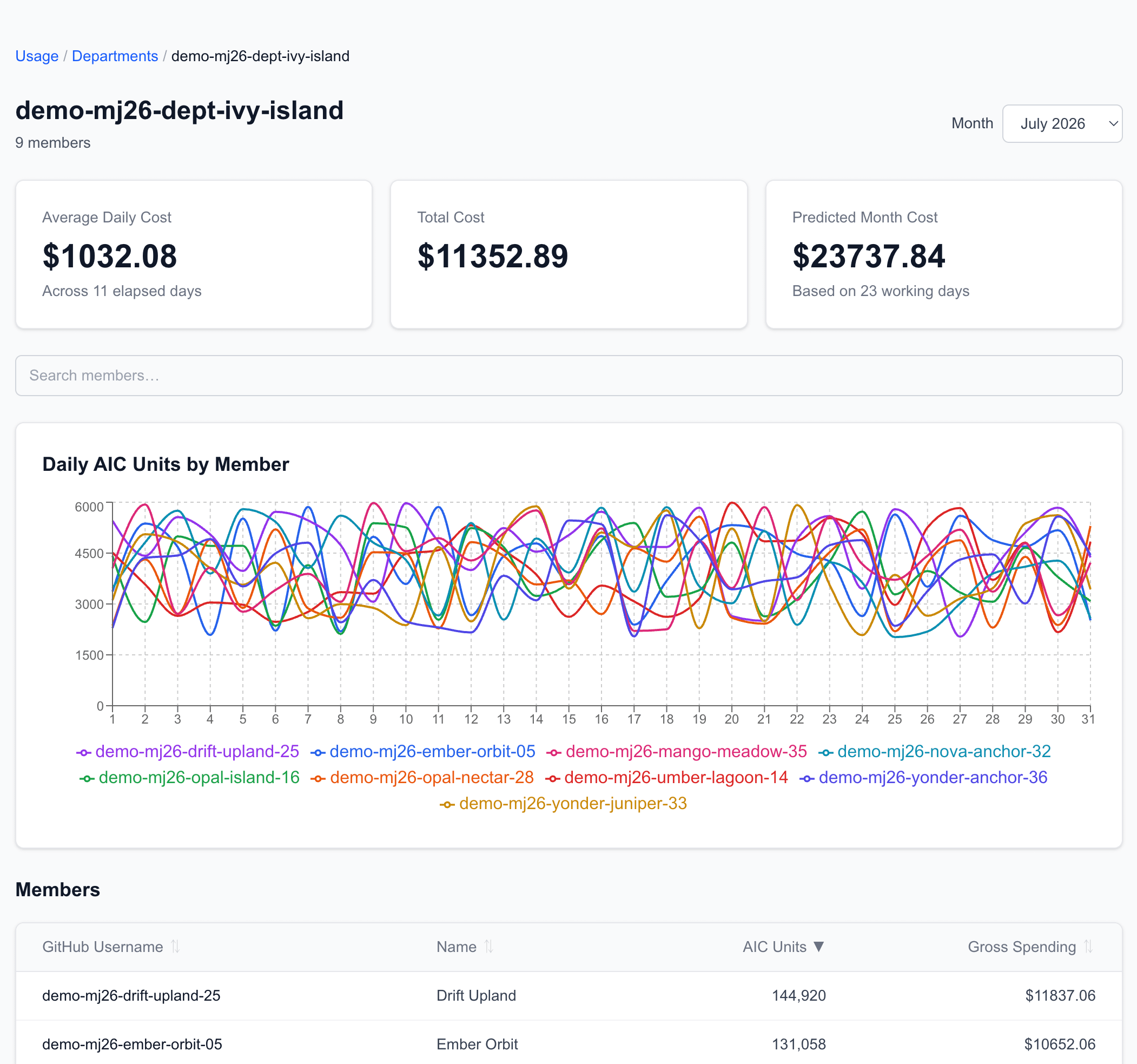
More features
On top of the basic overviews, you get more useful data too:
running totals of AI Credits imported and spent over time,
instant flags for the most and least active seats,
seat license costs kept separate from AI Credit usage costs.
6 AI usage tracking use cases
Like I said, we use the Copilot AI Usage Dashboard every day across all teams that use GitHub Copilot to optimize cost and model efficiency.
Here are some of our use cases.
1. Finding idle and heavy users
Thanks to our dashboard, we spot any idle seat instantly and decide whether the user should lose their license before the next invoice arrives.
And when we see a member burn credits past the norm, we schedule a one-on-one instead with them so we can understand why it happened.
2. Analyzing a user across teams
At TSH, one developer can work in two different projects with unrelated AI usage trends.
The current version of our dashboard accounts for it because you can place a user into more than one team and give a percentage value to their participation in each so the AI usage cost is divided accordingly.
Grzegorz was a full time team member of project Y, but then switched to part-time to join team X on a similar basis.
Now, Grzegorz’s AI usage is set to 50% for each of his teams.
This percentage value isn’t always a perfectly accurate representation of the user’s work across projects, but it gives a good enough approximation.
3. Finding the causes of usage spikes
The team-level historical overview ensures we know where spending spikes come from.
Three developers on one project spend more AI Credits some months than twelve people on another project combined.
The migration work they do burns more tokens than typical feature tasks.
With the dashboard, we can pin-point the spikes to specific project events to analyze them.
4. Finding low-hanging fruits for optimization
On a departmental level, we can find out which technology areas consume the most AI credits.
For example, we found that frontend tasks consumed the most so we could focus our optimization efforts there.
5. Determining the most cost-effective model for a job
The dashboard helped us see a model cost rise early.
The model was powerful, and we didn’t want to abandon it entirely.
So we continued using it for specific tasks, and switched to a cheaper model for tasks where the model performance didn’t matter that much.
In April, one model covered almost everything on the chart, Opus 4.6.
It was the strongest option at the time, and using anything saved next to no money, so nearly the whole team defaulted to it.
But then we saw AI Credit prices jump, so we added a balancer inside Copilot Collections that helps picks a model based on the task instead of defaulting to the priciest one.
GPT-5 now handles a lot of backlog grooming while Opus still carries most of the actual coding, and the chart shows a real spread instead of one bar towering over the rest.
6. Finding the most fitting model for a job
By giving our developers a framework with a great selection of models and analyzing their work, we make it a habit to learn from them.
For example, we see a pattern in which they choose specific models for different project phases, such as analysis, code generation, or review.
When a specific model does especially well, we can pass the information to EMs or even enforce the use of it.


Get started with the dashboard
The Copilot AI Usage Dashboard is open source, and getting your own copy running takes only a few steps.
Grab the installation guide here.
Keep in mind that the dashboard works out of the box only for those who use GitHub Copilot.
If you don’t but you still want to try it, you’ll need to do some heavy customization.
But even if you use a different coding assistant, forking our dashboard will still save you a lot of time compared to building it from scratch.
Next time
Next time, Igor Wnęk explains how AI is forcing changes in the software delivery lifecycle.
If you try to develop AI the old way, without updating the lifecycle, you won’t boost your productivity.
He’ll use Copilot Collections as the working example of a AI-native lifecycle.
Good luck out there 🤞

Fork the AI framework we used to make our dashboard!

Steal our AI delivery framework, seriously

Copilot Collections is available on GitHub, where you can download it to test it out or fork it to customize it.

Help us pay the bill for bitcoin mining

Published with a smirk by The Software House
Złota 59, Warsaw, Poland
tsh.io →
 | A guest post by
|